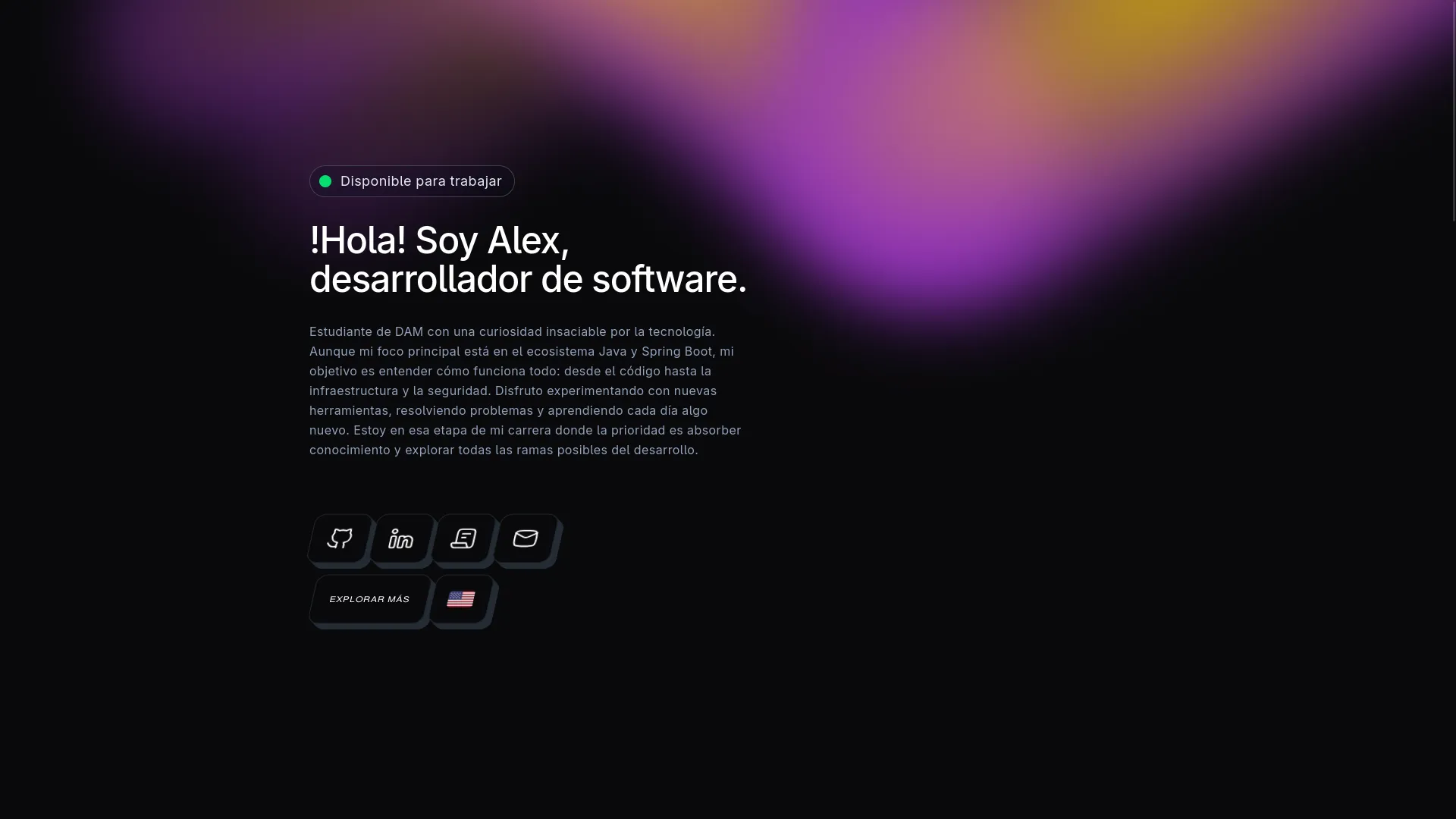
Overview
Creating this page is not a new idea, I had been turning it over in my head for a while. However, I initially thought my main goal was not to learn front-end, but to continue diving deeper into Java and Spring Boot to master back-end development. That was the case until I started MuuMe. When I developed a basic API for this project, I realized I couldn’t leave it without a graphical interface; after all, it is practically essential nowadays for a web messaging application.
It was thanks to this necessity that I decided to pause development completely to learn front-end, aiming to give it a professional and functional aesthetic. At first, I tried to learn on my own, relying on the little I remembered from my vague attempts in the past with HTML, CSS, and JavaScript, but I didn’t get very far. Then I discovered The Odin Project (TOP), which, although I didn’t exhaust every resource, served as a solid foundation for understanding how the entire web ecosystem actually works.
Originally, the idea wasn’t to make my own portfolio, but to gain fluency with these technologies to apply them to MuuMe. But after completing a TOP activity where I had to layout a “landing page”, I remembered that idea that had been with me for so long and told myself: “Why don’t I just make my own website?”. That is why I am writing this post today: to walk through the process I immersed myself in to create this, my own page.
Design #1: Imagination takes the lead
Like every learner diving into unknown territory, I designed a first draft for my website without really gauging the technical limitations or the time needed to bring it to life.
Unaware of fundamental aspects of user experience —such as the importance of not making the visitor wait— I wanted to implement an initial loading screen. The idea was to have the message “Hello Everyone,” appear, followed a second later by “Kattus here!”. This phrase, which I borrowed from the intro of SourSweet’s videos, fascinates me for its musicality, brevity, and simplicity. Once the phrase finished appearing, the user would have a few seconds to interact, or the page would advance automatically. The section change consisted of a complex animation: the current page would dim slightly —as if moving into the background— and the next one would appear from below, scrolling up and “devouring” the previous one. Once the transition finished, the main content would appear alongside a floating island at the bottom acting as a navigation menu.
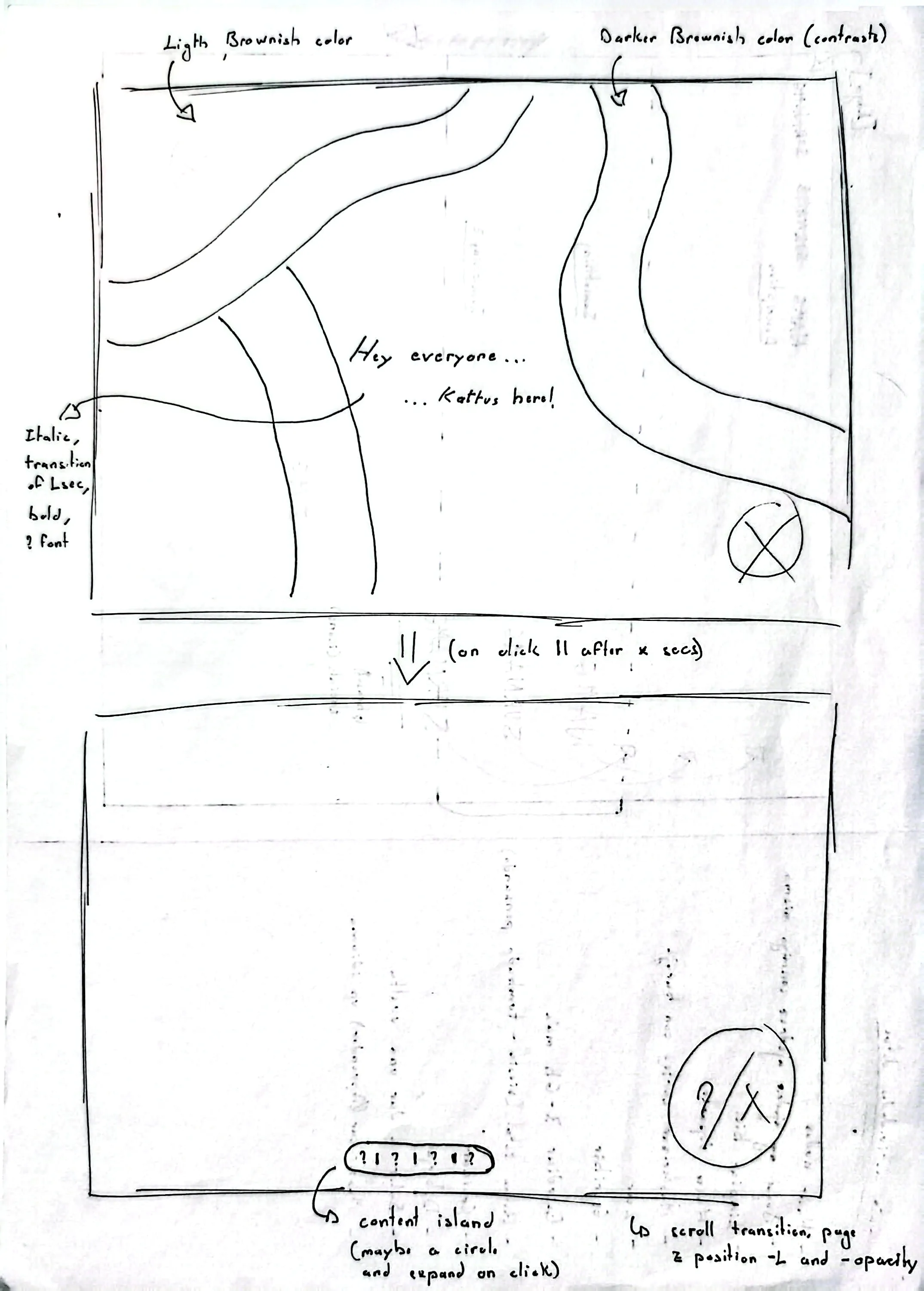
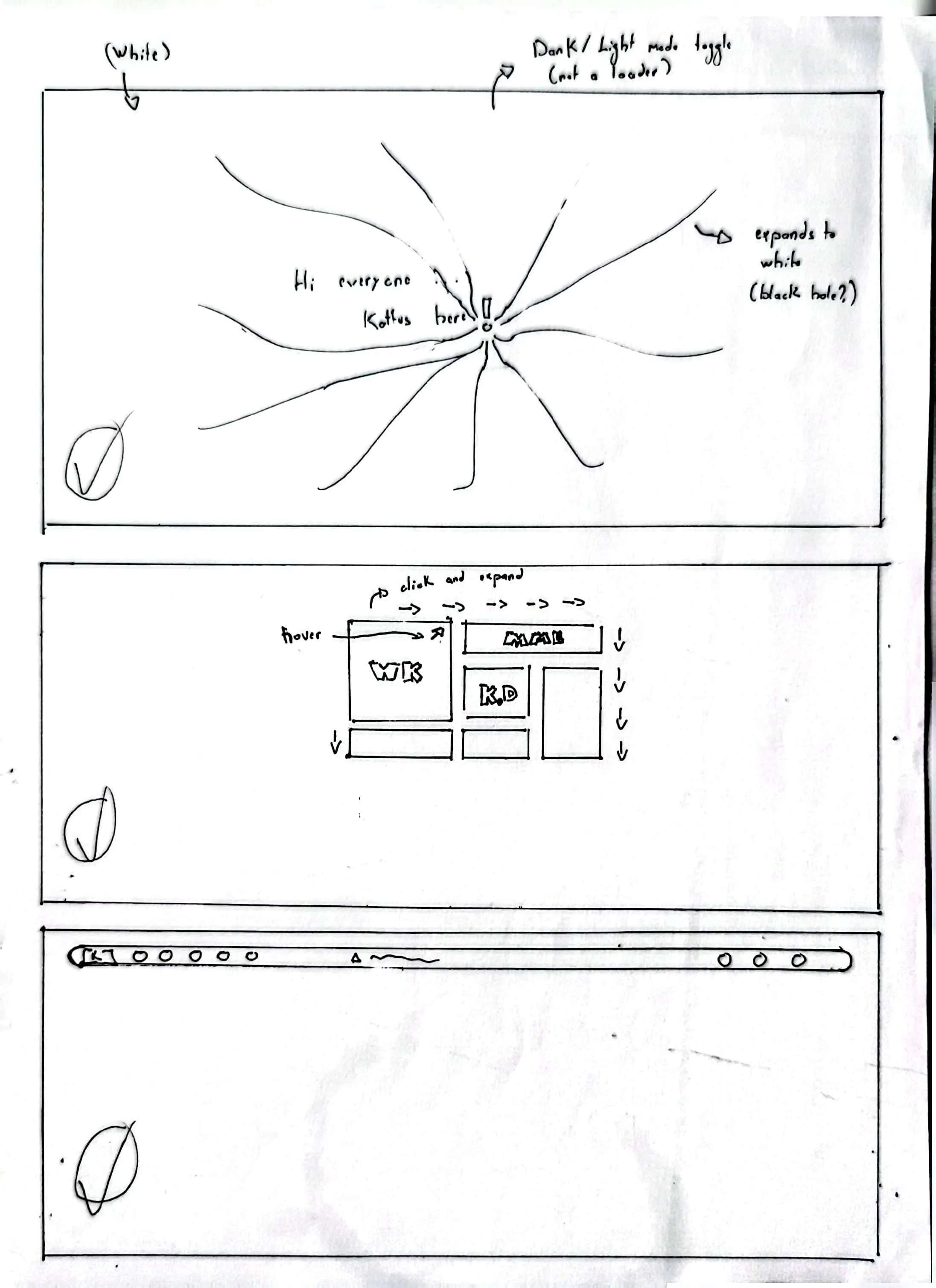
The technical complexity of these animations and transitions was excessive for a beginner —and to tell the truth, it still is— so I finally decided to discard the idea and opt for a much simpler approach.
Design #2: Kaelestia.dev
After a moment of clarity, I decided to draw inspiration from the aesthetic of my own operating system. On my laptop, I use Arch Linux, which allows me to use a window manager like Hyprland. Thanks to that, I was able to use a visual customization—or “rice”—that I adopted as soon as it was posted on the r/unixporn subreddit in mid-summer 2025: Caelestia.
I thought: “If I use this configuration every day and love it, why not bring it to my website?”. No sooner said than done. The result was a highly clean and spacious design, but I soon hit a snag: that elegance only worked well on large screens. I hadn’t taken into account the headache that mobile devices represent.
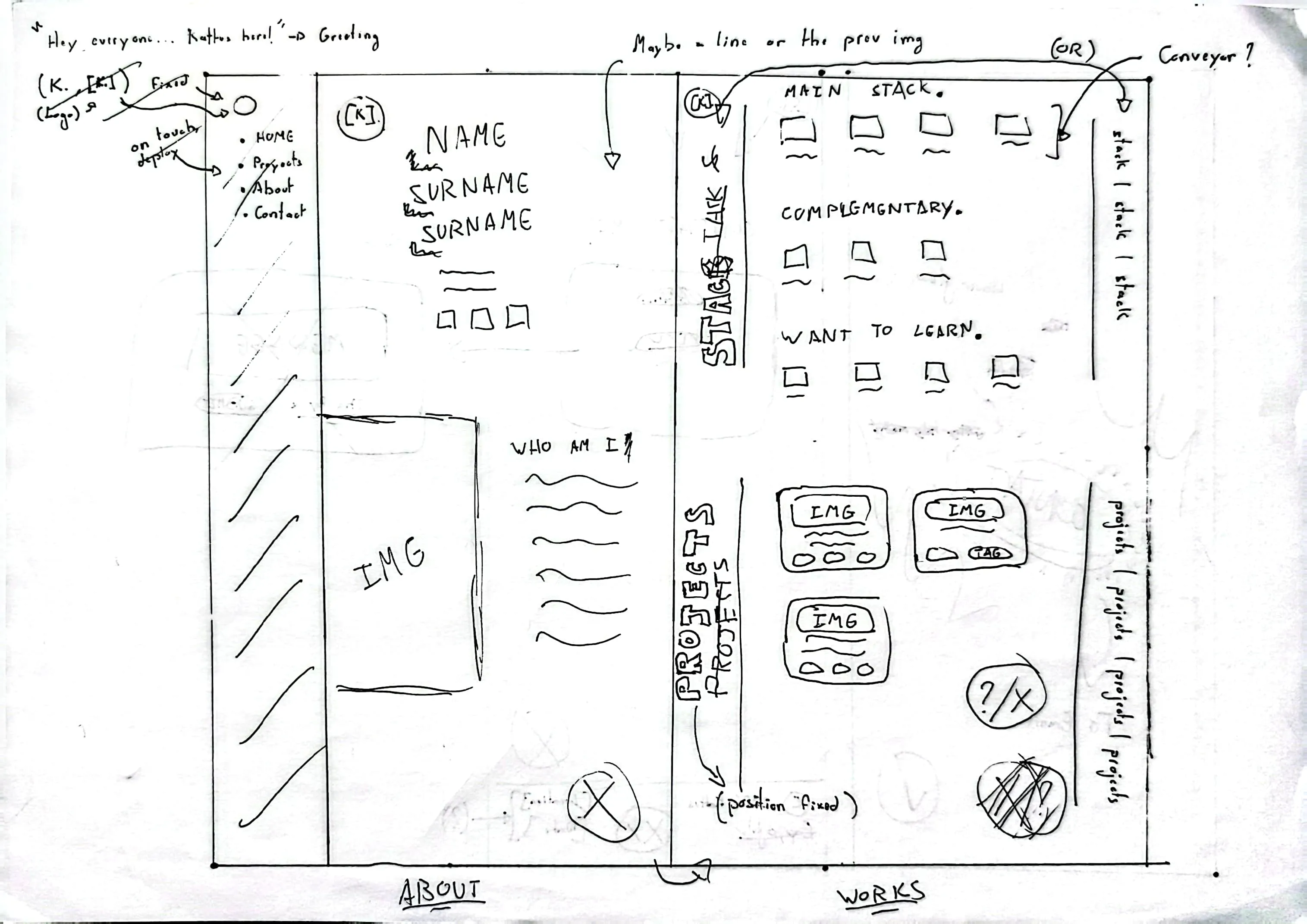
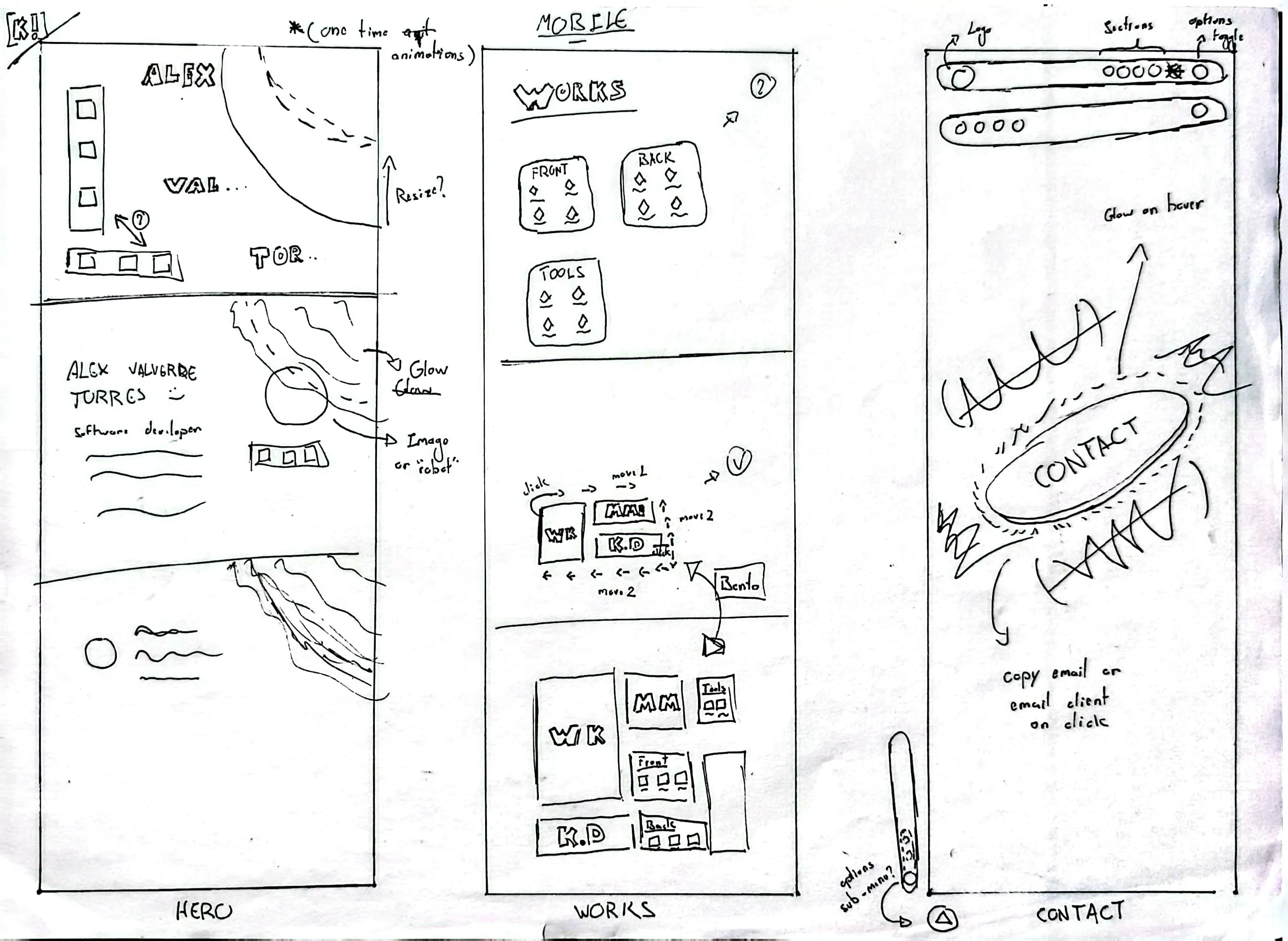
Yes, although the most characteristic part of the design —the sidebar— was removed. During these sketches, I experimented with different ways to replace it, and for the sake of speed in creating more sketches —since I’m not including all of them in this post—, I didn’t draw the window, only the content.
The mobile-first philosophy
Although I had heard of the mobile-first philosophy, I didn’t keep it in mind at the time. This approach is a standard in web development for a simple reason: it is much easier to scale elements of an interface upward than to try to compress them when they are already designed for large resolutions.
When I first implemented my Caelestia-based design on a mobile screen, the result wasn’t terrible, but I felt like I was lacking space. For the aesthetic to remain faithful to the original, it required wide margins, a sidebar taskbar, and a content window that, together, saturated the visible area. Although the idea doesn’t seem misguided today, looking back, I recognize that it wasted too much space; trying to make use of it would have meant sacrificing the readability of the content.
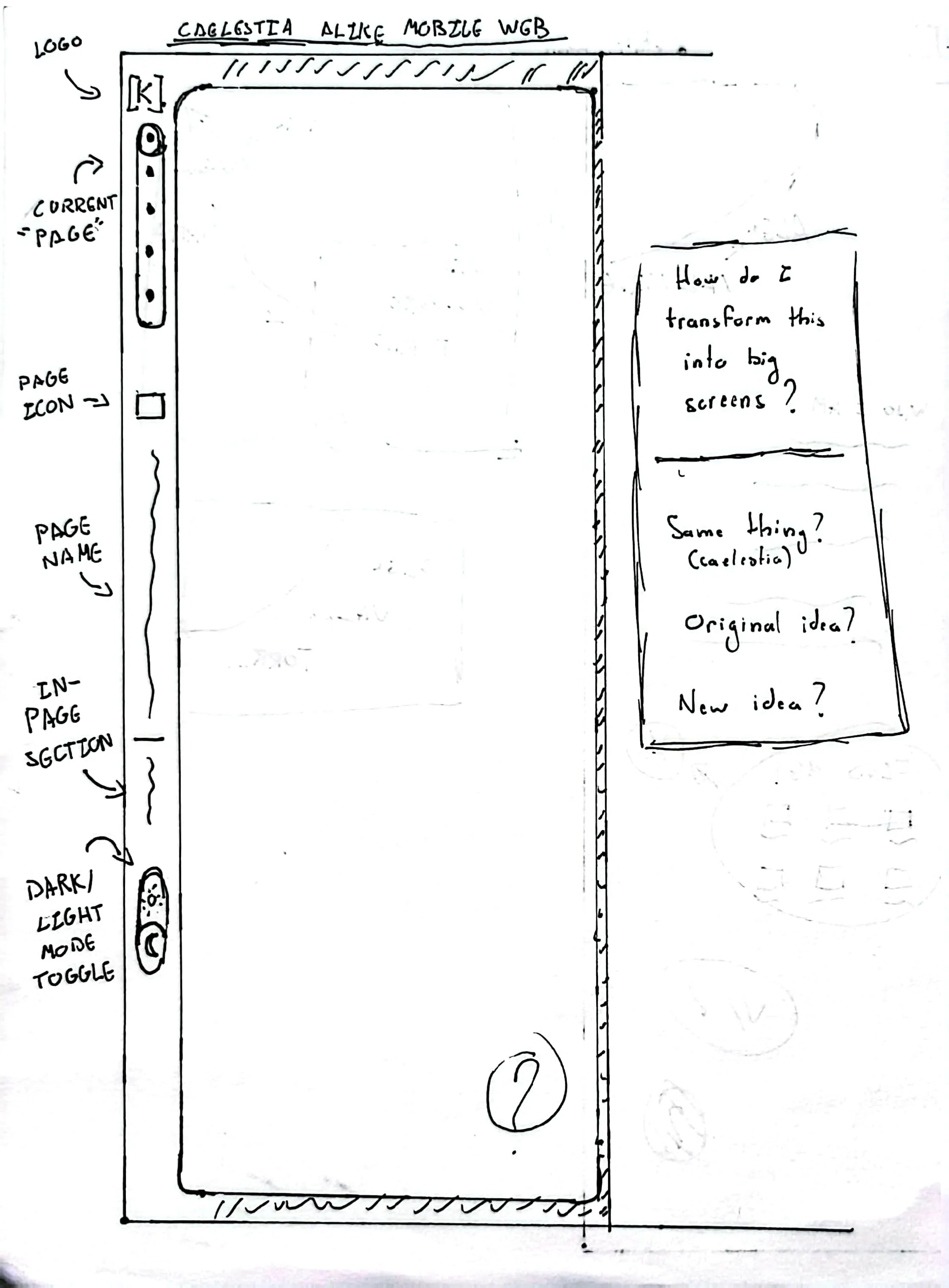
Following this experience, I always try to apply mobile-first design. However, this creates a personal conflict for me: for some reason, I am never satisfied with how web designs look on mobile devices, which leads me to discard ideas that, in another context, could have been very good.
Design #3: Exploring the Bento style
After exploring multiple sources of inspiration —from YouTube channels like MiduDev to platforms like Awwwards or BentoGrids— I decided to simplify my approach: I opted to design an interactive Bento. I also checked Godly, although it has recently changed course, transforming both its aesthetic and its catalog, moving away from that inexhaustible source of portfolios I found at the beginning of my search.
My idea was for the page to be composed entirely of a Bento-style design. Upon interacting with any of the blocks, it would expand, “devouring” the others to occupy the central space and show its content. It was an amazing solution to reduce visual clutter and concentrate information, but, like a good beginner, I hit a technical wall: I didn’t master TailwindCSS or design concepts like flexbox or grid.
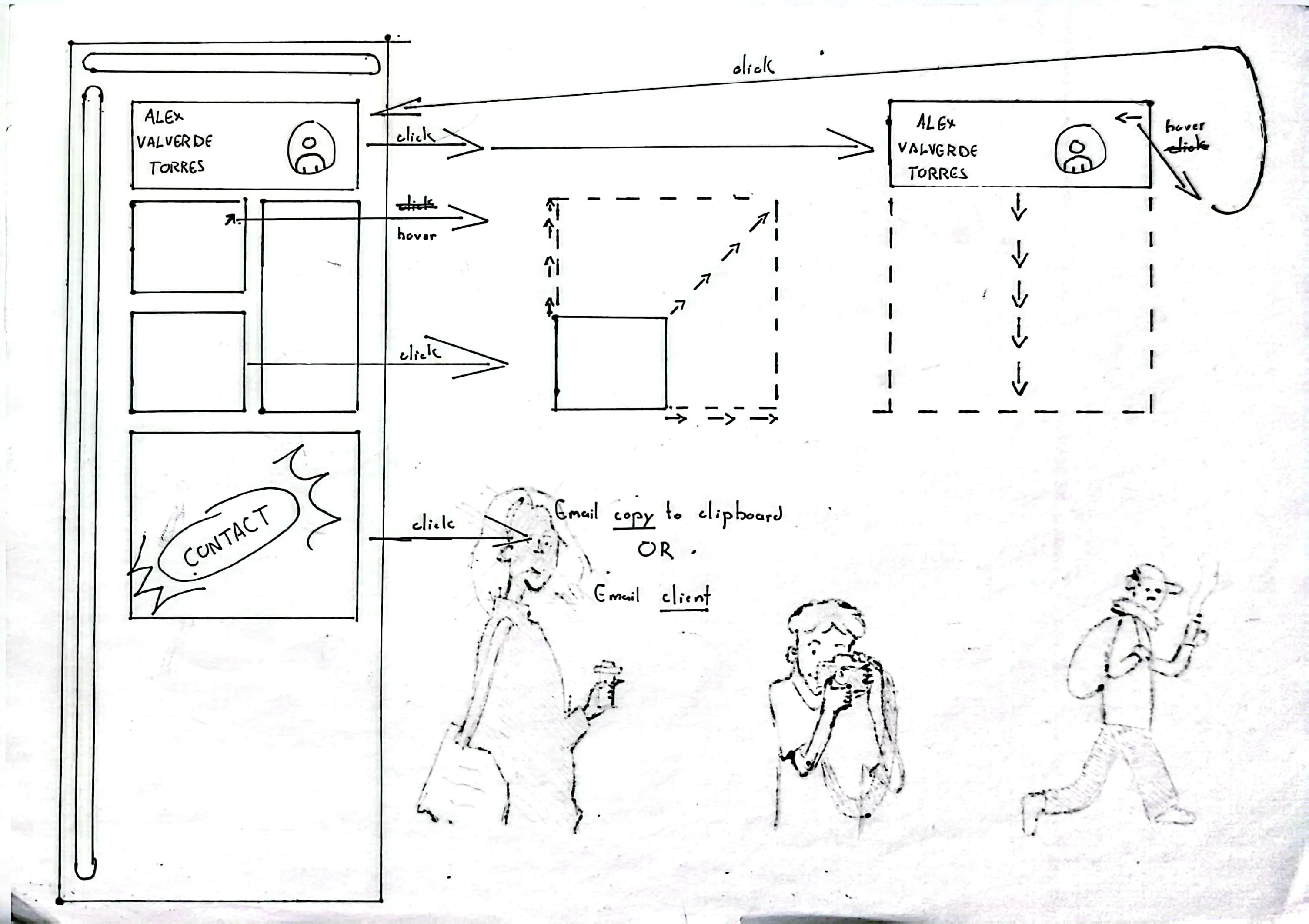
The sketches crossing the page are not part of the design.
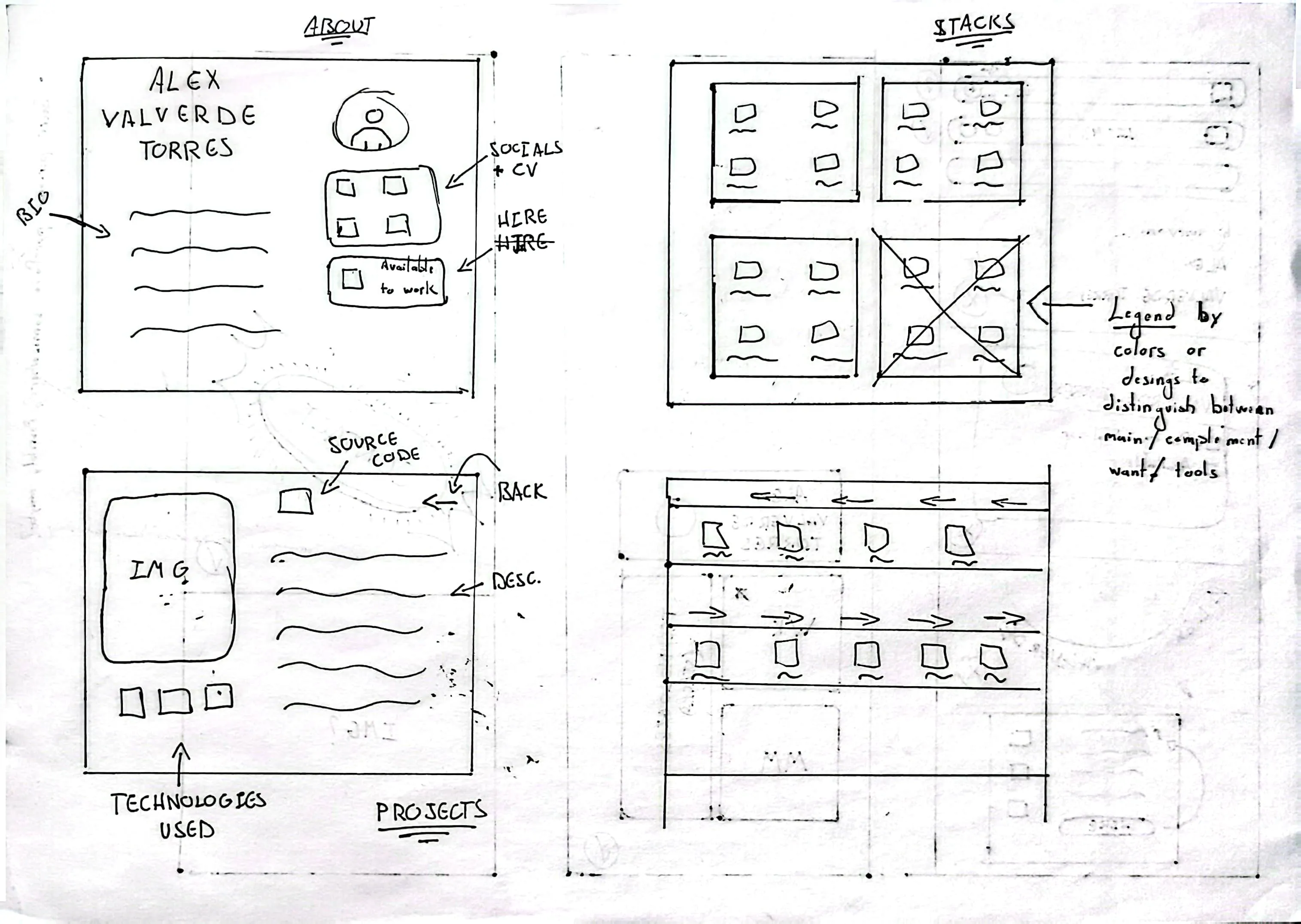
Design #4: Recreating to learn
After all this learning, I decided to build my portfolio taking the design of Jessica as a reference. Its aesthetic fascinated me, but upon analyzing it, I realized it used structures that, for my technical level, were too complex to replicate exactly.
Far from looking for a shortcut, I saw a learning opportunity: I decided to rebuild the design from scratch. Instead of cloning its architecture, I set out to recreate its visual essence using my own logic and my own tools (Astro and TailwindCSS). This process was an immense technical challenge. I had to figure out how to achieve that visual harmony, the choice of color palette, and the rhythm of the animations, discovering along the way that having the visual acuity to combine elements so well is, truly, an art.
Once the technical phase was overcome, all that remained was what I thought would be “the easy part”: replacing the placeholders with my own text. However, this was, without a doubt, the most complex task and the one I have been putting off the most. Choosing what to say and how to say it requires total concentration, especially when facing the drafting of project descriptions and blog posts like this one. Writing about what you do, with your own voice, is, once again, an art.
Styling with TailwindCSS
TailwindCSS is one of those tools that every front-end developer eventually comes across. It is simply fantastic. Although there is no shortage of critics regarding the obfuscation generated by the excess of classes in HTML, the ability to apply complex styles in a single line is impressive. Not to mention the agility it provides by eliminating the need to navigate through endless CSS files in search of a specific selector; I perfectly understand why it is the standard in the vast majority of modern projects.
However, it is not a tool without a learning curve. I don’t know if it’s because of its vast range of customization options or the natural complexity of laying out responsive elements that maintain aesthetic harmony, but Tailwind is not exactly trivial. We aren’t talking about difficulty on the level of low-level languages, by any means, but it is a tool so flexible and dense that the feeling of “mastering” it only comes after many hours of trial and error, playing with every possible combination.
The Astro Essence
Structure and Components
Astro has been the cornerstone of this project. Although it started as a framework optimized for static sites, its evolution has been remarkable. Today, through its “islands” architecture, it allows for the injection of dynamism—using components from other frameworks like React, Vue, or Svelte—only where it is strictly necessary. Its greatest strength is, without a doubt, its “zero-JS” philosophy: by default, Astro ships zero lines of JavaScript to the browser, which guarantees exceptional performance from the very first second.
When you start an Astro project using their CLI wizard, you are given the option to begin with a predefined structure. This is how a standard project is organized:
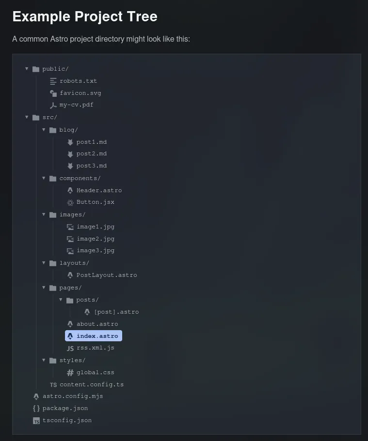
- Public: Static files that do not require processing or transformation.
- Assets / Images: Unlike
public, these files are automatically optimized and transformed to reduce their size and improve loading speed. - Components:
.astrofiles that act as reusable templates, preventing code duplication. Additionally, they allow for the integration of components from other frameworks. - Layouts: High-level templates that define the general structure of pages, allowing content to be wrapped in a common interface.
- Pages: The heart of the project’s routing; this is where routes, data loading, and the application of layouts are managed.
- Styles: The directory where files intended for global or modular aesthetic customization are stored.
- Content: A space dedicated to
.mdor.mdxfiles, designed to be rendered directly as HTML content.
Content Collections and Dynamic Routes
Beyond speed, what really captivated me was how it handles content. By working natively with Markdown—and in my case, with MDX—the writing experience is seamless. For a portfolio where blog posts are key, Astro’s Content Collections have been a lifesaver: they have allowed me to validate my content using Zod and keep everything type-safe, preventing common errors and facilitating long-term maintenance.
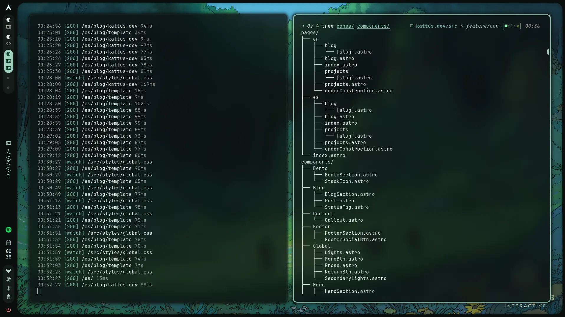
The development experience is outstanding. Dependency management is convenient, and its optimization capabilities are worth mentioning; for instance, the <Image/> component automatically transforms PNG or JPG files into more modern formats like WebP, drastically reducing weight without me having to perform manual processes. This very page is an example: what you are reading resides in an MDX file, processed efficiently to ensure instantaneous loading.
Internationalization (i18n)
This section presented a challenge to make the page accessible in languages other than Spanish, which was the original language. At first, I thought the translation would be done via an external API, but I discovered that Astro handles internationalization in a much more integrated way through three pillars:
i18nfolder: Containsui.ts(a dictionary with common phrases and words) andutils.ts(helper functions for translation logic).astro.config.mjs: Defines the available languages and how they should be handled in routing./pages/{lang}/: A folder-based routing system, where each language subdirectory (/es/,/en/) serves as a container for the translated pages.
However, it’s not all straightforward: the most laborious part is writing the articles. By opting for a manual implementation, without relying on external APIs or automated translation systems, I am forced to write each post twice—once for each language. This involves not only translating the content but also managing the frontmatter for each version individually. A tedious but necessary process to maintain full control over the quality and tone of my message in both languages.
What now?
Now that my portfolio is fully functional and has the aesthetic I was looking for, I can finally return to what started it all: the development of MuuMe. I do so with the peace of mind of knowing that my projects will not only be robust at a logical level, but that they will now also offer a polished and pleasant user experience.
Even so, this is not a final stop. This page is a living organism that will evolve; it is very likely that, as I continue to deepen my knowledge of new technologies, I will consider a redesign next year to integrate everything I’ve learned and continue polishing my own digital identity.